Case Study: Marble & Meadow
New York wedding floral design studio based in Flatiron, crafting editorial ceremony installations, immersive reception environments, and refined personal florals for design-led couples.
Note: Marble & Meadow is not a real studio. It is a brand that has been invented for the purposes of this case study. Stock Photographs by Kari Bjorn
✾ business objectives and metrics
Increase minimum client investment from $6k to $10k+
Reduce events below 10k minimum to < 10%
Attract more inquiries that match the studio’s budget and style
Reduce number of proposals per booked wedding from 3.5 to 2
Position the studio as a high-end, installation-focused florist
Raise average booked wedding value from $6.8k to $10k+
Increase planner-referred bookings from 20% to 40%
Increase events requiring installations from 30% to 75%
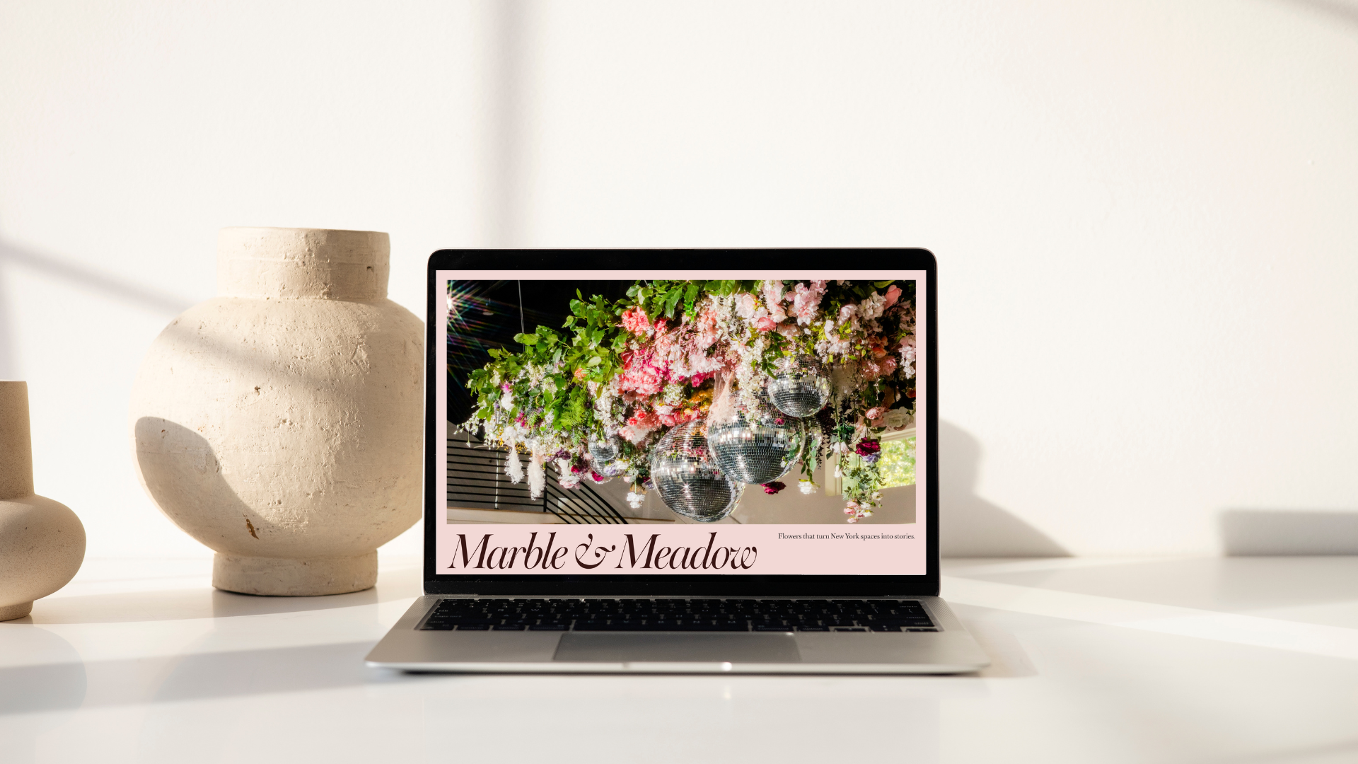
Full home page layout
Branding
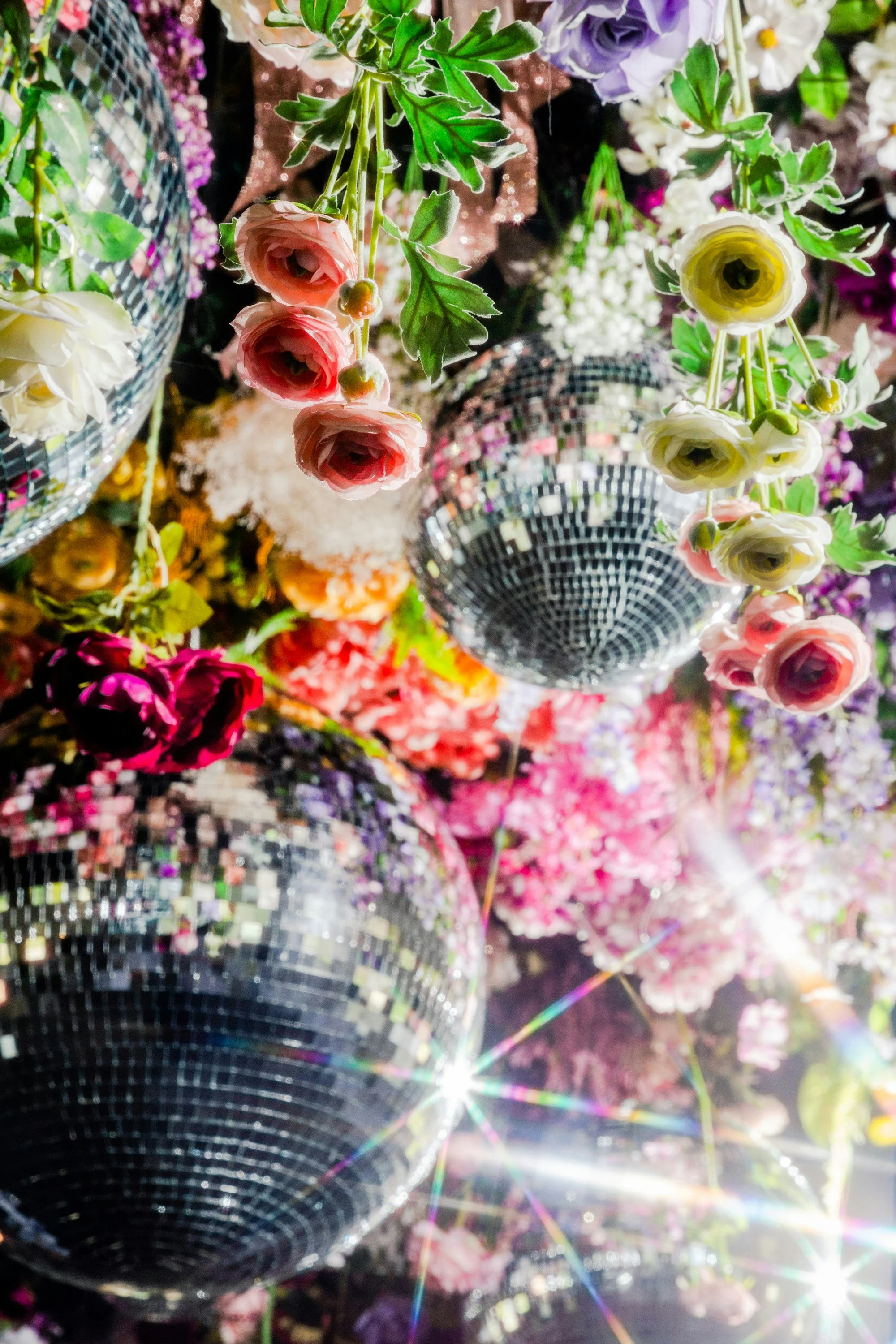
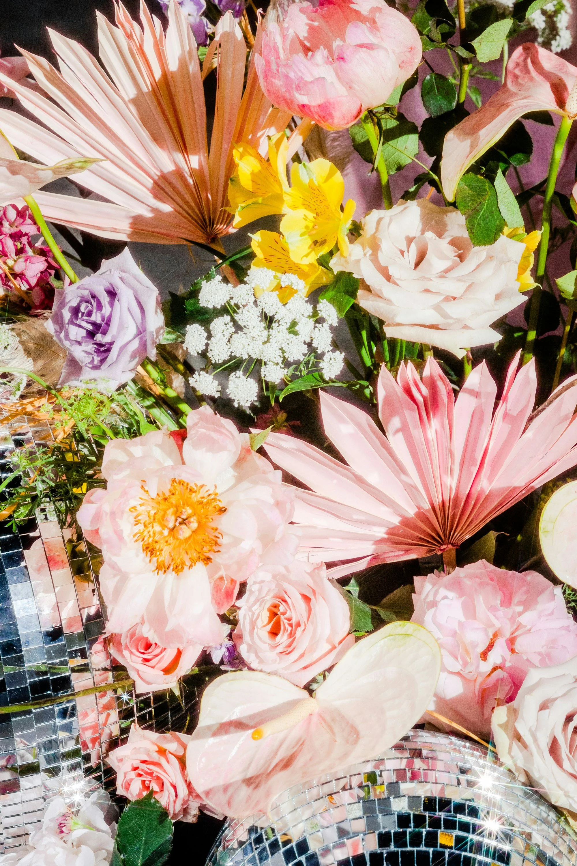
I wanted to make Marble & Meadow’s premiere portfolio piece shine, so I started with an image from their signature event and built a color palette around it. Muted tones of pinks and yellows were selected to convey the right balance of elegance and playfulness of their designs.
Web Design
The design was created in Figma. The two key problems I wanted to solve were (1) attracting the right clients and (2) reducing friction during the Marble & Meadow’s Inquiry process. These problems were considered in every detail, but here are some highlights to consider.
#1 showstopper hero image
The image selected showcases that Marble & Meadow are capable of large scale installations in a New York City location. No bleed small margins (as opposed to full width) convey a modern editorial sensibility. No other elements interfere with the initial impression of the image. This emphasizes the scale and quality of work that Marble & Meadow currently does and seeks to do more of. It communicates to the visitor “This is what I want to create for you” and sets the tone for the beginning of a luxury floral design experience.
#2 sticky call-to-action
Initially positioned at the bottom of the home page so that the eye goes to the hero image first, this navigation scrolls upward and then the primary CTA “Check My Date” sticks to the top and remains visible, so that it is always clear to the visitor what the next step is, bringing more visitors to the inquiry form!
#3 thoughtful inquiry form construction
In order to facilitate finding relevant images to early client design discussions, images are tagged with categories that are easy to remember and refer to. In practice, I would also recommend Marble & Meadow write captions for each image that include venue, and details that will convey logistical complexity (load-in/load-out, set up time, if a room flip was needed) to event planners. If possible, I would also recommending including what the budget would be to book for a similar design. All of these details help set expectations and attract the ideal customer (high end planners, design-focused couples).
#4 tag-based portfolio
Phrasing the CTA as “Check My Date” makes it clear that the customer doesn’t necessarily have to have it all figured out right now, and this is just to confirm the florists availability and begin a design discussion. The form also contains a budget dropdown, in which Marble and Meadow could enter custom budget ranges with their target minimums (in this example, starting at $10k). This has the power to increase conversions while also selecting for customers that have the appropriate expectations for how much to budget for collaborating with Marble & Meadow.
Web Development
If this concept were to be realized as is, I would do so using Webflow for high fidelity and maximum flexibility with Marble & Meadow’s inquiry process. With some minor tweaks, it could also be developed on Squarespace.